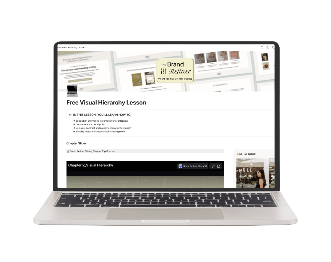
Find out what’s making your designs feel off & how to fix them with this FREE Visual Hierarchy Lesson.
You’ve got the fonts, colors and imagery. You’re using the “right” brand elements.
But somehow the design still feels busy, awkward, and cluttered… or just not as polished as you wanted.
This free Visual Hierarchy lesson will show you how to spot when too many things are competing for attention, decide what should stand out first, and make your designs feel more polished without adding more stuff.
Note: This lesson is one full chapter from the Brand Refiner, my visual refinement mini-course for business owners who already have some brand pieces but want to get better at actually using them.